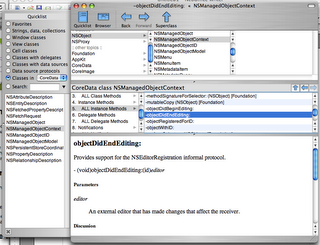
 After posting about Docoa browser a couple people suggested I try AppKiDo which looked like a decent alternative. After testing it out for a while I thought I'd post some thoughts about it.
Upon launching it, AppKiDo takes a minute and begins parsing your documentation files, unfortunately this happens EVERY time you launch it. Upon completing this the documentation browser is launched. Right away unfortunately I saw something that I wish was different, I'm sorry but the brushed metal interface should really be changed to a unified interface. I installed UNO to see how AppKiDo would look with a unified UI (yeah I know I could have probably edited the NIB file, but I was lazy here) and it definitely looks better.
AppKiDo has somewhat of an odd interface, on the left is a drawer and on the right is where you can see all the documentation and it's various attributes. The Quicklist (drawer) has some usefull attributes like allowing you to only view things like view subclasses, classes with delegates, window classes, etc. Additionally you can search for classes, methods, etc in this drawer as well.
The window itself has 3 components: (1) A Browser (optional – can be hidden) This allows you to browse up and down the various classes as well as protocols, functions,etc for specific frameworks like AppKit, Foundation, Core Data, etc. (2) Detail view – This shows you the list of functions, procols, etc of any object you have selected. It has one big advantage over Docoa Browser and Xcodes Documentation browser in that it can show you all methods for a particular class, not only the ones specifically for that class but ones that it has inherited which makes AppKiDo very powerful in this instance. (3) The Documentation Viewer itself shows you the documentation for whatever you are looking at.
Overall AppKiDo is very powerful and definitely a good documentation browser. Yet at the same time I find myself wanting to rearrange the interface, AppKiDo doesn't feel natural. I may not know what the right interface is, but at the same time I know when something is wrong. Some things like the fact that I can browse classes just for specific frameworks on the quicklist drawer, but can't do the same in the browser feels incredibly akward.
Don't get me wrong I feel AppKiDo is a very powerful application, I just feel like it's user interface is holding it back and when it's interface gets a overhaul it could very well be the perfect documentation browser.
AppKiDo can be downloaded from here: http://homepage.mac.com/aglee/downloads/appkido.html
UPDATE: One commenter informed me I indeed overlooked the preferences where the brushed metal UI can indeed to be turned off, still brushed metal really shouldn't be the default
Sunday, October 29, 2006
[Helpful App] AppKiDo
 After posting about Docoa browser a couple people suggested I try AppKiDo which looked like a decent alternative. After testing it out for a while I thought I'd post some thoughts about it.
Upon launching it, AppKiDo takes a minute and begins parsing your documentation files, unfortunately this happens EVERY time you launch it. Upon completing this the documentation browser is launched. Right away unfortunately I saw something that I wish was different, I'm sorry but the brushed metal interface should really be changed to a unified interface. I installed UNO to see how AppKiDo would look with a unified UI (yeah I know I could have probably edited the NIB file, but I was lazy here) and it definitely looks better.
AppKiDo has somewhat of an odd interface, on the left is a drawer and on the right is where you can see all the documentation and it's various attributes. The Quicklist (drawer) has some usefull attributes like allowing you to only view things like view subclasses, classes with delegates, window classes, etc. Additionally you can search for classes, methods, etc in this drawer as well.
The window itself has 3 components: (1) A Browser (optional – can be hidden) This allows you to browse up and down the various classes as well as protocols, functions,etc for specific frameworks like AppKit, Foundation, Core Data, etc. (2) Detail view – This shows you the list of functions, procols, etc of any object you have selected. It has one big advantage over Docoa Browser and Xcodes Documentation browser in that it can show you all methods for a particular class, not only the ones specifically for that class but ones that it has inherited which makes AppKiDo very powerful in this instance. (3) The Documentation Viewer itself shows you the documentation for whatever you are looking at.
Overall AppKiDo is very powerful and definitely a good documentation browser. Yet at the same time I find myself wanting to rearrange the interface, AppKiDo doesn't feel natural. I may not know what the right interface is, but at the same time I know when something is wrong. Some things like the fact that I can browse classes just for specific frameworks on the quicklist drawer, but can't do the same in the browser feels incredibly akward.
Don't get me wrong I feel AppKiDo is a very powerful application, I just feel like it's user interface is holding it back and when it's interface gets a overhaul it could very well be the perfect documentation browser.
AppKiDo can be downloaded from here: http://homepage.mac.com/aglee/downloads/appkido.html
UPDATE: One commenter informed me I indeed overlooked the preferences where the brushed metal UI can indeed to be turned off, still brushed metal really shouldn't be the default
Friday, October 27, 2006
[Helpful App] Docoa Browser
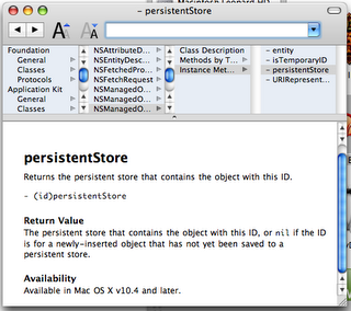 Hello everybody! I just wanted to post something you may find interesting. Docoa Browser (based on Cocoa Browser from a LONG time ago) has been updated to run on the most recent documentation from Apple!
If you don’t know what Docoa Browser is, it’s basically a slim and fast documentation browser which allows you to browse most documentation by browsing through a simple column view which you can go through very quickly. I really liked this browser before when I was first learning cocoa and I still like it today. If you find the built in documentation browser to be a bit slow at times you can give Docoa browser a try. This was just posted to the Apple Cocoa mailing list yesterday, and I was only able to download it during my Ames Mac Users Group (AmesMUG) meeting, so I haven’t had a lot of time to test it, but so far it’s worked really well.
Now to be honest this app probably won’t satisfy all your documentation browsing needs, but it should perform well for basic documentation browsing. You can download it from here (warning! this is just the source code and not a prebuilt binary so you'll have to compile it yourself): http://www.muratnkonar.com/docoafortiger/Docoa-0.3.4mnk.zip
Tuesday, October 24, 2006
[Commentary] Thoughts on the HIG
Im working on my next tutorial which will appear soon, but for now i’d thought I’d share a few thoughts and see what you all think.
Ok once again there seems to be a big topic on everybody’s minds and this time it’s the Human Interface Guidelines. Scott has some insightful commentary on this. I believe early on when I first started learning Cocoa, I took a look at this document. As far as I can remember people have been chastising Apple for not following it. Right away some things didn’t make sense like the specific types of apps that brushed metal was supposed to be used on, etc.
Personally I don’t think I’ll read the HIG again anytime soon. Why? Because if you really think out a solution and take into account the users perspective while following what should be common sense, you don’t really need the HIG.
Remember when your designing an app, your designing a solution to a problem so you should try and make it simple. Right away when someone looks at your app it should be very apparent what the app does and give the user a good idea of how it works. If someone has to spend a good while looking around at your app to begin to figure out these things then your solution is already too complicated, they might not be able to use everything right away but they should get the gist of it.
A big pitfall of some developers is throwing too much at your user. A good example is maybe your developing a simple image edit app. If your user is typically a amateur photographer and just wants to maybe crop and do some adjustments to the image quality, do you think they’ll really need a metadata inspector window constantly showing and taking screen real estate?
Of course you can suffer from the exact opposite of this and throw too little at your user to the point where they are constantly opening up things. For example Im not pro photographer but, I presume Apple did some research and decided it was a good idea for pro photographers to have access to a bunch of panels for color correction, image adjustment, metadata, etc in Aperture.
Another thing I tell myself when designing UI’s is “Don’t be like the Windows developers!” Now this is not to say that all windows UI designers are crap, it’s just there are so many Windows programs I look at and go “why did they do this?” and “wtf is the purpose of this?” and so on.
One of my friends who goes to Iowa State University told me in one of his classes they covered this new Windows framework (who’s name escapes me at the moment, I think it’s the windows presentation framework or something like that) that can make all these magical UI effects. He was in a group and they were designing a UI which I believe was a login window or something like that. Should be simple right? Well they wanted to have a paper clip dance around the window and have other visuals. My friend (evidently being the only sane person in the group) didn’t like this idea. Around this time the teacher came by, now you think anybody who was sane would chastise the group for putting up such a dumb idea that wastes so much resources on something so simple. But the teacher thought it was a good idea. Now I should issue a disclaimer that not all teachers at ISU are like this thankfully.
So in conclusion here are the basic points
- Identify what the problem is your solving
- Define everything you require to solve the problem
- Don’t throw everything at once to the user, define the common tasks your users will be performing on the app and design around that (but allow them to get to the more complicated parts easily if they need to get to them)
- Design everything around the basic purpose of your app
- Go for the simplest solution first (you’ll get more done faster and your users will love your app because they can get things done faster) even if it takes a little bit of trial and error to find what that is “the simplest solution is usually the most elusive” - Jonathan Ive (may not be exact quote, I can’t find my iMac movie)
- Don’t waste resources on things you really don’t need in your app.
Monday, October 16, 2006
Coming Soon...
Sorry I haven't written for a little bit, first I was surprised that I was picked up by CocoaDevCentral and then I kept spending lots of time working on AssignmentTracker X. The Good news is im planning on an expansion into the LicenseKeeper app and will show you how to auto sort items in Core Data and always restore the length of columns the user sets them to in tables, and maybe a couple other little things if I get around to it.
It's just an easy one to get me back on track of writting here more. For now I must work on getting AssignmentTracker X 2.0 Beta 1 out the door then I'll write here.
Monday, October 09, 2006
Holy Crap I've been picked up by CocoaDevCentral!
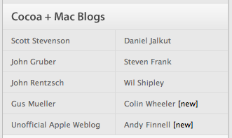 I was taking a random look at the performance of my sites and realized I never looked at how my brand new blog Cocoa Samurai is doing. When I saw the chart I saw a huge surge of visitors to the page, when looking at where the visitors where coming from I saw CocoaDevCentral on the list. When I visited the page I saw my name right next to Wil Shipley.
Friday, October 06, 2006
[Commentary] Cocoa vs. Carbon
Wil Shipley seems to have started what eventually would become a big rolling snowball with his entry linked in my previous entry. It's gotten Daring Fireball and Scott Stevenson talking.
What's going on here is a grievance against the fact that several frameworks Cocoa programmers must use are only available in Carbon. Why is this a big grief? Carbon frameworks are written in procedural C style language which is a big departure from the object oriented style of Objective-C.
The reason I prefeer Cocoa/Objective-C myself is because it's so easy to use and get straight to what you want. A good starting example of this is CTGradient which I am using for various elements in AssignmentTracker X currently.
CTGradient is an Objective-C wrapper around Core Graphics (which is written is Carbon/Procedural C) and because of that I can write a couple lines of code and be done with it. To be specific heres a short example of a NSView subclass using CTGradient copied straight from AssignmentTracker X's 2.0 source code
@implementation ATXStartupWizardBackgroundView - (id)initWithFrame:(NSRect)frame { self = [super initWithFrame:frame]; if (self) { swGradient = [[CTGradient unifiedNormalGradient] retain]; angle = 90; } return self; } - (void)drawRect:(NSRect)rect { [swGradient fillRect:rect angle:angle]; } @endsimple and really easy! All you have to declare in the header is a CTGradient instance and a float for the angle, and if you take a look at the CTGradient source code... well it's doing a lot for you for such a simple function of creating a simple gradient grafted onto a NSView. In fact way more than I'd ever want to begin to show you here, just download it and take a look at it for yourself and you'll get an idea of why if this is a lot for just a gradient, it must be a ton for other functions. It's not that C is crap, far from it. I still continue reading through The C Programming Language 2nd Edition written by Denis Ritche himeself and appreciate a lot of things in C. C is a good programming language but in some instances like it's used in Carbon, it clearly shows it's limits. Heres something that's never really been said yet (at least not directly), when your going from Cocoa to Carbon your literally thrown from one world to another. When your in Cocoa your relatively familiar with the bounds, limits and expected behaviour of cocoa world, then suddenly your thrown into the land of procedural programming. At the very least Apple should be aware this severely limits the learning curve for new programmers or even Cocoa veterans who have never touched Carbon before and thus limits the productivity of the mac developer community as a whole. I have to agree with Wil Shipley here in that regardless of Carbons origins it's only been used as a compatibility library and really to help all the Mac programmers out there we need to move all the frameworks to Cocoa. When they are all moved to Cocoa, Apple can do all the optimizing on the backend and provide us with an easy Objective-C interface on the frontend in a similar way that they did with Core Data, thus reducing the amount of code in all apps, increasing programmer productivity, and allowing more of the devleoper community to show off all the great stuff in Mac OS X.
Thursday, October 05, 2006
[Links] Cocoa vs Carbon & Searching with Google Code
Wil Shipley on Carbon vs Cocoa
Our good friend Wil Shipley has written up a good article on why some frameworks desperately need to be moved from Carbon to Cocoa: http://wilshipley.com/blog/2006/10/pimp-my-code-part-12-frozen-in.html
Scott Stevenson on searching for code with Google Code
Scott Stevenson has written up a good starter intro to searching for code under specific programming languages and licenses: http://theocacao.com/document.page/312
Moved to Blogger Beta
If you get all articles brand new in the RSS feed it's not a bug in your RSS agregator it's the fact that I just moved my blogger blogs to Blogger Beta which is great because it doesn't require that I spend time waiting for articles to publish now it's just done. The only downside is that once I publish the first article under the new beta all articles come as brand new.
Monday, October 02, 2006
[Tutorial] Good Documentation with Doxygen
 Well today's tutorial isn't specific to Cocoa, but it's a good tool Mac Developers should use. Doxygen is a simple tool that goes through your source code and auto generates documentation which you can browse through in several formats. If you've browsed through Xcodes menu's you'll have noticed in the Script menu there is a category for HeaderDoc which Xcode provides the ability to insert predefined HeaderDoc comments for generating HeaderDoc documentation.
After some experience with HeaderDoc I can tell you it's no where near up to par with Doxygen. Doxygen's documentation is much easier to browse through and much nicer on the eyes as well so I'll show you how to use Doxygen.
Step #1 - Download Doxygen
Download Doxygen from here: http://www.stack.nl/~dimitri/doxygen/download.html#latestsrc
Step #2 - Create your Projects Doxyfile
The thing about Doxygen is that you don't need to actually distribute the documentation, you can just distribute the Doxyfile for your project which is a configuration file that tells Doxygen how you want it to create the documentation. When someone wants the documentation all they need to do is load the Doxyfile into Doxygen and tell it to go and generate all documentation.
So now lets launch Doxygen, you'll get a window like this
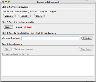 Before we continue I reccomend (though it's not necessary) that you create a folder called "Documentation" in the root level of your project directory (the same one that has the *.xcodeproj file.)
Now click on the Wizard button...
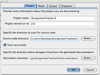 Here you fill out the basic info about the project like the name, version, etc. The source code directory is where you have placed all your source code files you want Doxygen to create documentation for. Really you should have a "Source" folder at your root level of your project for all source code (not auto generated by Xcode) in your project, either way point the source directory at the root level of your project directory and tell it to scan recursively. Then point the destination directory at your newly created Documentation directory.
Switch over to the "Mode" tab...
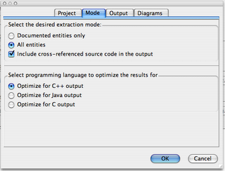 Here is where you may want to change settings to what you personally (or your team) want. Personally I reccommend that you tell Doxygen to generate documentation for all entities and include corresponding source code so you know everything that is and isn't documented as well as see what was in the source code at the time the documentation was generated. Leave it optimized for C++ output and switch over to the "Output" tab.
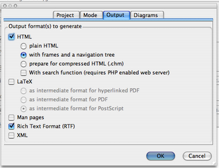 Here again you can chose what you like, but really the easiest to navigate around in (IMHO) is to generate with frames and a navigation tree. The search function requires PHP and since Xcode can search your methods and text pretty well i'd leave that alone as it's really unecessary. You'll also want to uncheck the LaTeX option and if you like you can also generate a nice RTF file containing your documentation as well.
After that switch over to the Diagram tab and tell it to not generate any Diagrams as Xcode can do this much better than Doxygen can. Click ok and you'll be brought back to the Window though Step 2 will say it's not saved. Click the save button and save the Doxygen file in your Documentation folder.
Step 3 - Generate the Documentation
Now by Step 3 on the Doxygen window click the Select button and point it at your Documentation folder. Then go down to Step 4 and click the Start button and Doxygen will go through and start generating your documentation. When you look at your Documentation folder again you'll see a html folder and (if you selected it) a rtf folder for each type of Documentation respectively. You can browse through all your classes now... the only thing is theres no documentation just a listing right now.
Step 4 - Write Documentation
So lets write some documentation! Ok well it's not that painful, trust me it'll help a lot of people. Everytime I think about documentation I remember this quote from a KDE mailing list
Documentation is like sex, when it's good it's really really good and when it's bad it's better than nothing at all.So here's how you write Doxygen documentation For instance items in your header (*.h) file you would create documentation like so...
NSButton *saveButton; /**< On main window to save all data */ NSArrayController *objectsArrayController; /**< Main table columns are binded to this array */ NSWindow *mainWindow; /**< Window visible at launch for loading views into */The next type of documentation can be done on your header file as well as your *.m implementation file for method documentation
/** Generates a number of categories from the number specified in n @param n number of categories to generate */ - (void)generateCategoriesWithCount:(int)n;the "@param" is used to tell Doxygen about the method parameters you want it to document. Lastly you can provide a description of the classes themselves in the Documentation. This I would place before the #import
//! ATXAboutBoxController. /*! ATXAboutBoxController is a class based on Adium's LNAboutBoxController with some tweaks and is designed to display the aboute box in a scrolling credits text box with some simple version information on other text labels, setting options in Interface Builder whenever possible. */Once you do that to all the source code you can and rerun Doxygen, you get something beutiful...
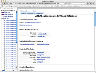 Questions? Comments? Write a comment below to let me know what you think!