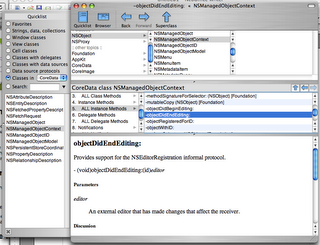
 After posting about Docoa browser a couple people suggested I try AppKiDo which looked like a decent alternative. After testing it out for a while I thought I'd post some thoughts about it.
Upon launching it, AppKiDo takes a minute and begins parsing your documentation files, unfortunately this happens EVERY time you launch it. Upon completing this the documentation browser is launched. Right away unfortunately I saw something that I wish was different, I'm sorry but the brushed metal interface should really be changed to a unified interface. I installed UNO to see how AppKiDo would look with a unified UI (yeah I know I could have probably edited the NIB file, but I was lazy here) and it definitely looks better.
AppKiDo has somewhat of an odd interface, on the left is a drawer and on the right is where you can see all the documentation and it's various attributes. The Quicklist (drawer) has some usefull attributes like allowing you to only view things like view subclasses, classes with delegates, window classes, etc. Additionally you can search for classes, methods, etc in this drawer as well.
The window itself has 3 components: (1) A Browser (optional – can be hidden) This allows you to browse up and down the various classes as well as protocols, functions,etc for specific frameworks like AppKit, Foundation, Core Data, etc. (2) Detail view – This shows you the list of functions, procols, etc of any object you have selected. It has one big advantage over Docoa Browser and Xcodes Documentation browser in that it can show you all methods for a particular class, not only the ones specifically for that class but ones that it has inherited which makes AppKiDo very powerful in this instance. (3) The Documentation Viewer itself shows you the documentation for whatever you are looking at.
Overall AppKiDo is very powerful and definitely a good documentation browser. Yet at the same time I find myself wanting to rearrange the interface, AppKiDo doesn't feel natural. I may not know what the right interface is, but at the same time I know when something is wrong. Some things like the fact that I can browse classes just for specific frameworks on the quicklist drawer, but can't do the same in the browser feels incredibly akward.
Don't get me wrong I feel AppKiDo is a very powerful application, I just feel like it's user interface is holding it back and when it's interface gets a overhaul it could very well be the perfect documentation browser.
AppKiDo can be downloaded from here: http://homepage.mac.com/aglee/downloads/appkido.html
UPDATE: One commenter informed me I indeed overlooked the preferences where the brushed metal UI can indeed to be turned off, still brushed metal really shouldn't be the default
Sunday, October 29, 2006
[Helpful App] AppKiDo
 After posting about Docoa browser a couple people suggested I try AppKiDo which looked like a decent alternative. After testing it out for a while I thought I'd post some thoughts about it.
Upon launching it, AppKiDo takes a minute and begins parsing your documentation files, unfortunately this happens EVERY time you launch it. Upon completing this the documentation browser is launched. Right away unfortunately I saw something that I wish was different, I'm sorry but the brushed metal interface should really be changed to a unified interface. I installed UNO to see how AppKiDo would look with a unified UI (yeah I know I could have probably edited the NIB file, but I was lazy here) and it definitely looks better.
AppKiDo has somewhat of an odd interface, on the left is a drawer and on the right is where you can see all the documentation and it's various attributes. The Quicklist (drawer) has some usefull attributes like allowing you to only view things like view subclasses, classes with delegates, window classes, etc. Additionally you can search for classes, methods, etc in this drawer as well.
The window itself has 3 components: (1) A Browser (optional – can be hidden) This allows you to browse up and down the various classes as well as protocols, functions,etc for specific frameworks like AppKit, Foundation, Core Data, etc. (2) Detail view – This shows you the list of functions, procols, etc of any object you have selected. It has one big advantage over Docoa Browser and Xcodes Documentation browser in that it can show you all methods for a particular class, not only the ones specifically for that class but ones that it has inherited which makes AppKiDo very powerful in this instance. (3) The Documentation Viewer itself shows you the documentation for whatever you are looking at.
Overall AppKiDo is very powerful and definitely a good documentation browser. Yet at the same time I find myself wanting to rearrange the interface, AppKiDo doesn't feel natural. I may not know what the right interface is, but at the same time I know when something is wrong. Some things like the fact that I can browse classes just for specific frameworks on the quicklist drawer, but can't do the same in the browser feels incredibly akward.
Don't get me wrong I feel AppKiDo is a very powerful application, I just feel like it's user interface is holding it back and when it's interface gets a overhaul it could very well be the perfect documentation browser.
AppKiDo can be downloaded from here: http://homepage.mac.com/aglee/downloads/appkido.html
UPDATE: One commenter informed me I indeed overlooked the preferences where the brushed metal UI can indeed to be turned off, still brushed metal really shouldn't be the default
You are quite true about the metal interface... but it can simply turned off in the preferences. After the relaunch of the AppKiDo you will have unified UI :)
ReplyDeleteFor the loading time or dokumentation parsing at loading the app. That's ok for me, as I start the app once and the keep it in hidden in the Dock till I need it.
I like Docoa more, but it didn't compile on my MacBook (while it did on my G5) and I did found the time yet to remove the glitch. So, till then, I can use Docoa only on my PowerMac
It is open source and if you care enough making those UI changes wouldn't be that difficult. Adding NSCoding support to archive the parsed documentation shouldn't be that difficult either. I've actually considered working on both before but never got around to doing it.
ReplyDelete