As I am finishing up my other article I thought id take on a challenge and do what nobody has done yet in doing an in depth analysis of the iPhone software and what it'd take to develop for it should Apple ever allow it. Hey I am up for a good challenge Ok lets get off on even ground here and briefly cover what Apple has said about the iPhone and Mac OS X on it.
- The iPhone will use a touch screen which leaves it dependent on good touch detection software
- touch screen for controls, ignores unintended touches, multi-finger touches for controls
- iPhone runs Mac OS X (albeit a stripped down version) with Syncing, Networking, Multi-tasking, Low Power (power management), security, video, Cocoa, Core Animation, Graphics, Audio
- Proximity Sensor to detect when objects are near (ie taking a call)
- Ambient Light Sensor
- Accelerometer (for detecting when you've switched from portrait to landscape)
- Added necessary Drivers for the iPhone hardware
- Added necessary utilities for Syncing, Networking, Power Management, Graphics, Audio
- Added Mac OS X Frameworks Cocoa, Core Animation, etc.
- Heavily modified the UI to System to display windows, dialog boxes, etc differently for this smaller interface and created the iPhone SDK
- Wrote a new login sequence to deal with the touch sliding login
- Wrote a Menu screen to show all the apps and have the dock-like app selection at the bottom
- Wrote the iPhone apps
- The iPhone shows the same cocoa controls we know with some sporting some theming to blend in with the iPhone UI, these controls include NSButton, NSSegmentedControl, NSSearchField, NSToolbar, etc
- They all have a top window toolbar and some have a bottom window toolbar that are the same size across the apps (with the exception of Safari allowing a little bit more space at the top for displaying a web page title which suggests they are expandable in size (at least to a degree)). The toolbars appear to be either a grayish blue color or a glossy black with the ability to set the opacity for both the top and bottom toolbars as demonstrated in the Photo app (even the topmost status bar also appears to be able to have it's opacity set as well)
- All sheets that slide in animated onto an existing view come up from the bottom vs dropping down from the top like on the Mac OS X we use currently, all views appear to slide up from the bottom as well.
- Im guessing the keyboard view that pops up is probably something that any app can call and use with the app (like Font Dialog, Color Dialog, etc.)
- There is no dark grey / light grey repeating background pattern anywhere in the UI like in the standard Mac OS X default background. The UI is entirely solid colors or gradient patterns. The New way to build Apps on the iPhone Clearly instead of heavily modifying an existing interface it’s clear that the iPhones approach is a brand new method all together. We can all clearly see that there are no “windows” in this approach, but rather views and ways of switching between views. In the same way that when an app launches on Mac OS X it has a main window that is spawned, the apps on the iPhone has a primary view that is displayed. Clearly in a device such as this your app needs to be very simplistic and get straight to the point of the app right away without cluttering the screen. Another thing to take into consideration are the fonts. In addition to have a very small screen to work with, the fonts on everything are bigger than you’d be used to in developing Cocoa apps on Mac OS X. Many controls and labels shown have bolded fonts, typically these controls appear to be the ones displaying what view your actually in (for ex a label saying Favorites to display that you are in your favorite contacts,etc) while secondary controls actually appear to have a very small, but readable, font. The Screen is another thing to take into consideration. Clearly whoever is using the iPhone can switch the view from portrait to landscape at anytime so your app needs to take advantage of that. Im guessing here 1 of 2 things happens (1) Nothing happens - your view is simply resized and draws again in a different frame size (2) Your app implements a method to do something different when the orientation is changed so you can do something special if need be and is implemented something like
- (void) orientationChangedToLandscape: (NSEvent *)event; - (void) orientationChangedToPortrait: (NSEvent *)event;or
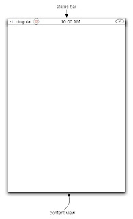
- (void) orientationChanged: (NSEvent *)event { if([NSOrientationCenter viewOrientation] == NSPortraitOrientation) { //we changed to portrait } else { //we changed to landscape } }though I think the first example is the much more likely. So lets explore some theoretical iPhone apps! From all appearances when you begin creating an iPhone app you have the entire screen, minus the top status bar, to work with.
 As you’ve undoubtedly seen by now we have a lot of vertical space to work with and not so much horizontal space. This entirely rules out sidebars as it’d take up way to much horizontal space and most likely waste some good screen real estate. We’ve even seen some controls such as NSBrowser have their functionality changed entirely as instead of having several columns visible on the screen at once we only have one and switch between them.
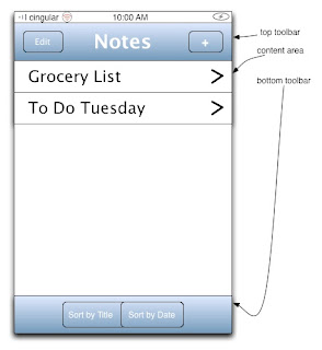
So what should we build? Lets build a simple notes application. Now the iPhone already has this, but i’ve never seen it demonstrated or seen any screenshots of it. I chose this because this demonstrates many of the aspects of all apps (with the exception of music) as shown in the keynote. Now we may want to put a ton of options in this app, but we really need to plan this out well. So what are the critical functions we need to get out on the first view?
 In this case I decided to go with 2 toolbars and a content area containing a list of the notes. Here we did a lot with a little. We implemented the following functions
(1) Ability to add notes
(2) Ability to delete notes from list (via edit button, i’d have a minus icon appear by the title and if they want to edit they click the title or if they want to delete hit the minus icon by the title)
(3) Ability to edit notes
(4) Ability to sort notes
Not much to it and i think that’s about all we can do with this space, anything more and we’d probably begin to clutter up the screen. And that’s the way we need to think when designing an app.
When you click a title of a note we have another view come onto screen via some sort of Core Animation transition. I’d assume we could swipe over to a view containing something very similar to the e-mail app with a title field and a notes text field. Very Simple. The only thing unclear here is how we designate a new view to be the primary content view and how we switch between them through core animation. Does each app have some sort of controller with a pointer to the primary view and when we want to switch we do it like
[self transitionToView:(NSView *)newView viaCoreAnimationType: ...
or something all together different?
Multiple Mouses oh my!
Now much has been discussed about the multiple mouses aka multi finger gestures as seen in “this pinch” when steve jobs used the gesture to zoom in and out of a photo view. I personally didn’t think this would be very hard to deal with and this is why. The operating system is aware that multiple contact points could be used as mouses. Presumably this has a limit of 2, though we don’t know this for sure. However when I watched the demo I noticed that by far the 2 common things steve did was
(1) slide fingers across the screen
(2) tap controls on screen
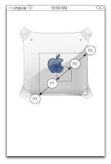
We can use “the pinch” though the only apps that used that was the photo viewing app and Safari. However lets say we want to use “the pinch" for something, in this case we may want to make a better photo viewer app or just anything that we’d need to zoom in on something. Based on the keynote here is how i think it works
(1) Two contact points are made
 (2) At this point the distance between them could be measured and a notification may be sent to the view telling it to prepare for zooming or the 2 points could be used as points to create a frame reference on the image or view
(3) When the user moves the fingers a notification is sent to the view and the view is then zoomed in or out so the points on the first frame match the points as they are currently
 This diagram isn’t an exact match in terms of zooming in, but you get the idea. In order for any app to deal with this well it needs
(1) To be notified when 2 contact points are made
(2) To be notified at an interval as the resizing is happening so the view can redraw appropriately
(3) To be notified when the resizing stops
One interesting thing I saw was that (as far as I could tell) the photo view didn’t need to pause and adjust the image on the fly as seen in iPhoto, that is during resizing the photo didn’t get pixelated and then adjust and smooth out the image when the resizing stopped.
Beyond this we don’t know if the iPhone is capable of recognizing other gestures. Can it recognize circles for instance? I know mockups of the true full screen ipod had this, but the demo only showed sliding gestures. It’ll be interesting to see the range of gestures the iPhone is capable of when it comes out.
Conclusions
Clearly the iPhone is a totally different environment than has ever been presented before. Instead of windows we have views and switching between the views via Core Animation. As this is not open we really have no idea of how things work right now, but based on how Cocoa and Core Animation work currently we can make some good educated guesses. It’s clear that in order to make good apps for this device we may not be able to use all the NSControls and those that we can use right now and we may not be able to use them in the same ways we use them on Mac apps right now.
I would have to think that even though Apple has said we will not be able to put our own apps on there, someone probably will hack the iPhone and find a way to put apps on there. After all the apps on there can’t be written in stone, Steve Jobs himself implied they put the touch screen there so that they can update the apps in the future and implement new ones if need be.
There are many unanswered questions like if someone hits the home button while doing something in the middle of an app and you go back to the original app do you go to where you left off or the primary (first seen) view? Can the apps themselves set this behavior? Are we using Xcode and Interface Builder to create these iPhone apps or some tool altogether different? Do you have to run the apps on the iPhone or is there some emulation environment to test them in? I may think that it may be possible to code the iPhone apps in Xcode, but for designing the UI and testing them it may require something unique as I think compiling a project then uploading the app to the iPhone each time you wanted to run the apps would drive you insane.
In the end all of this is really just my best guess, I could wake up tomorrow and realize that part of this is totally wrong, I could just be full of it. What do you think?


7 comments:
Sounds right on to me...although NSOrientationManager seems a bit far fetched. :)
Let's just hope they open it up for us.
Is it too far fetched to think of an emulator for development purposes? It was the way Palm OS worked, and still many PDAs have their emulators for the dev cycle...
Given the animations on Apple's website of the functionality of the iPhone, I firmly believe there is a full emulation tool that allows developers to test their software. I imagine an XCode for iPhone complete with and Interface builder and resource management.
Recycle and Reuse. That is the Cocoa way. I doubt you'll even need an emulator. I have a feeling we'll be able to compile iPhone apps for Intel & ARM (possibly PPC) All you'll need is Mac OS X (leopard), Xcode, the iPhone SDK, and a multi-touch Mac.
Yes, I said multi-touch Mac. I'll be terribly surprized if the next iMac doesn't have multi-touch, but it probably won't be called an iMac.
I guess you might be right for the orientation event handling.
Concerning gestures I think that a minimalistic solution could have been choosen by Apple: consider zoom-in and out as mouse-weel events.
Zoom-in could be similar to scroll-up, zoom-out as scroll down.
This way Cocoa API would not require to change for iPhone specific behavior.
Wouldn't it be simplier?
When Steve said the iPhone would be "closed," I don't imagine this means no one will be able to develop apps for it. I think what he meant was, if you want your app to end up on iPhones, you're going to have to make it available through the iTunes store. This allows Apple to QC the application, make sure it's not malware, and to ensure the users that whatever they're downloading into their iPhone from the iTunes store has been given the sniff test by Apple.
Apple currently does the same things with iPod games, right?
Hmm. Lotsa speculations. Mr. Jobs said in NY that they will release the requirements to get SDK for iphone end of feb.
Post a Comment